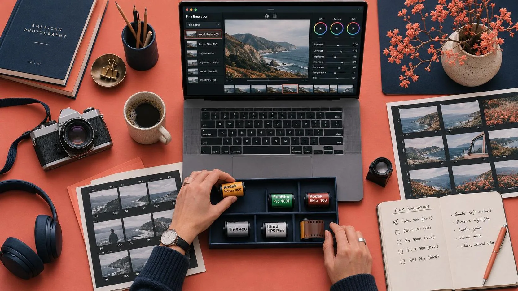
Film emulation is the practice of making digital images behave more like images captured and finished on film. For video, that means more than dropping grain over a teal-and-orange grade: you shape contrast, color, highlight roll-off, and texture together. Start with a balanced image, build one restrained look, and check it across a sequence. The goal is not to disguise every digital pixel; it is to make the visual treatment support the scene.
What makes a film look convincing?
Film responds to light and color differently from a digital camera, and different stocks, processing methods, and prints produce different results. There is no single film look. A soft, warm portrait and a punchy, cool night exterior can both feel photographic without looking alike.
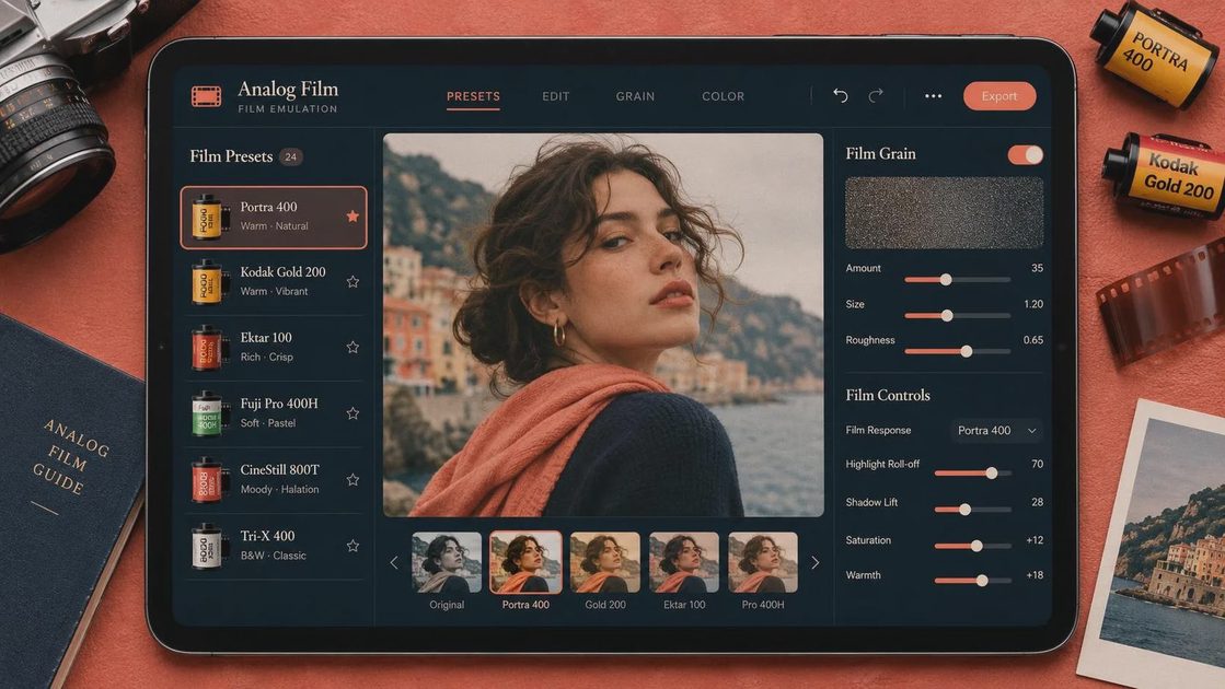
For practical film emulation, think in layers. Contrast determines how quickly shadows fall dark and highlights approach white. Color changes the relationship between skin, foliage, skies, and practical lights. Grain adds fine, moving texture. Halation, the reddish glow sometimes visible around bright highlights, can suggest another physical characteristic of film, but it is easy to overdo.
None of those choices fixes flat lighting or an inconsistent shot. If a window is blown out in the original footage, a curve cannot reconstruct missing detail. And if every shot has a different white balance, one preset will exaggerate the differences instead of tying them together.
Prepare the footage before adding a look
Start with the edit, or at least a representative sequence. Choose shots with different exposure and color challenges: a face near a window, a wide exterior, and a darker interior, for example. A look that flatters only the easiest close-up is not ready for the timeline.
Normalize camera footage using the appropriate color management or the camera manufacturer’s recommended transform. Log footage usually needs a proper conversion before you judge contrast and saturation. Standard-looking footage may already have a display transform baked in, so applying another conversion can produce crushed shadows and harsh highlights.
Next, balance exposure and white balance shot by shot. Use scopes alongside your eyes: a waveform helps you see where shadows and highlights sit, while a vectorscope shows the direction and relative strength of color. Neither tells you what the scene should feel like. A night scene can remain dark; the point is to keep important detail and color relationships under control.
If you mix cameras, get them reasonably close before applying a shared creative treatment. Match neutral objects and skin tones where they appear, then compare cuts at normal playback speed. A pleasing still frame can hide a distracting jump between angles.
Build film emulation in a workable order
I would make a simple version of the look before reaching for specialized effects. In your editor or color-grading application, work from the image’s broad structure toward its smallest details:
First, shape contrast. Lift or soften the deepest shadows only if the scene benefits; milky blacks are a stylistic choice, not a requirement. Compress bright areas gently so highlights transition rather than ending in an abrupt hard edge. Watch faces and practical lights as you adjust.
Second, tune color relationships. Reduce oversaturated channels selectively rather than draining the whole image. A warm highlight can be appealing, but if skin turns orange while a white wall goes yellow, pull it back. Small changes tend to travel across more shots than dramatic ones.
Third, consider a film emulation LUT or dedicated effect as a starting point. A LUT is a color transform, not a complete stock-in-a-box: it expects a particular input and can clip or distort an image if used incorrectly. Read the documentation, put it in the intended part of your color pipeline, and compare the result with the effect bypassed. Avoid stacking multiple heavy transforms just because each looks interesting on its own.
Finally, add grain at the delivery resolution or check how it translates there. Fine grain can disappear after compression; oversized grain can look like crawling digital noise. If the effect offers size and strength controls, start low and watch the image moving, not just paused. Apply it consistently across the sequence, with exceptions where a shot genuinely needs them.
Match AI-generated shots to camera footage
Generated video adds another problem: the image may change its texture or color from frame to frame. A prompt can request a film-like image, but it does not guarantee stable grain, consistent faces, or highlights that behave the same way through a cut.
For a generated insert, describe lighting and composition before the finish. For example: “Static medium shot of a rain-soaked bus stop at dusk, soft practical light, muted colors, natural contrast.” Add a modest film reference if it helps steer the image, then generate options. Avoid asking for heavy grain in the prompt if you plan to add controlled grain in the grade; baked-in texture can shimmer or compete with the finishing pass.
Bring the chosen clip into the same timeline as your camera footage. Match its overall exposure and color first, then apply the shared look. Watch for edges that pulse, background details that morph, and skin tones that drift as the subject moves. Those are generation or source issues, not problems film emulation can reliably solve. A shorter insert, a different take, or a cutaway may work better than a stronger grade.
Check the tool’s export and usage terms before committing generated material to a client project. Resolution, compression, watermarking, and commercial permissions can vary by plan and affect whether an attractive clip is usable.
Check the finished sequence, not just the grade
Watch the cut full-screen and at the size your audience will actually see. Look especially at faces, bright windows, skies, and the transition between generated and photographed shots. Then export a short section using your intended delivery settings: compression can smear fine grain, turn smooth gradients into bands, or make dark footage look muddy.
If the texture becomes distracting on a phone, reduce its strength or simplify the treatment rather than sharpening everything. Keep an ungraded or minimally graded version of each shot available so you can revise without baking effects into the source.
The best film emulation is not necessarily the most visible one. It is the treatment that lets a sequence feel coherent while preserving the light, performance, and details that made you choose those shots in the first place. A good shot is not just generated. It is chosen.